KeepFluent 2.0
Mobile App Redesign


The Challenge
Design a solution to provide caregivers and organization leaders with a way find and hire culturally-competant social service providers, specifically translators and interpreters.
The Role
Lead UX Researcher
(User Interviews, Surveys, Affinity Mapping, Competitive Analysis, Usability Testing, A/B Testing, Card Sorting/Sitemapping, Prototyping)
The Teammates
Rachel Chou (Content Strategist)
Lionel Valentin (Information Architect)
Kelli Peach (Lead UI Designer)
The Client
Aspire to Age - Public Benefit Corporation
The Tools
Figma, Miro, Confluence, Asana, KardSort, Google Suite
The Timeframe
3-Week Sprint
The Summary
Aspire to Age is a public benefit corporation that offers care services for the elderly community in Austin, TX with an emphasis on quality, trustworthiness, and cultural competency. To further their mission, the company has created the platform KeepFluent, which allows discovery and delivery of services via trusted partners and providers.
In designing KeepFluent 2.0, Aspire to Age’s ultimate goal is to create an all-in-one platform for caregivers to obtain a variety of social services (healthcare, housing assistance, translating services) for the people they themselves are aiding.
Our team’s goal was to redesign the request management process and design a solution that can serve as a use case for future features as the KeepFluent platform broadens.
Discovery Research
In our introductory client meeting, Aspire to Age leadership introduced our team to the current iteration of their platform, a.k.a. KeepFluent 1.0. Our clients asked us to redesign the request process for KeepFluent 2.0, which they expressed they wanted to be a native mobile app.
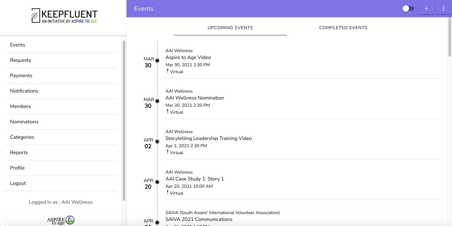
KeepFluent 1.0 Home Page
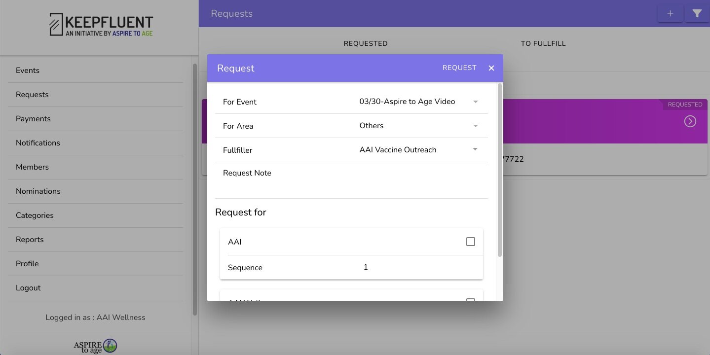
KeepFluent 1.0 Request Process

Request Details Page

Notifications Page
Unfortunately, due to unforeseen circumstances out of our control, we were delayed in our project by about a week. That meant that we had to squeeze in our design sprint into 2 weeks instead of the 3 that were originally allotted to us.
Because of this obstacle, our team was unable to access to the KeepFluent platform to conduct usability testing, nor did we have access to the existing user base on file to conduct user interviews quite yet. But we soldiered on!

During this delay, we had to find a way to get our work off the ground. The first place I suggested we turn to was a competitive analysis.
That, too, was a challenge. Leadership at Aspire to Age described their vision for the platform in a way that made it clear there were no direct competitors for us to look to for comparison.
I realized we needed to cast a wide net to try and gather design patterns from all over that could influence our designs.
So, how did I do that? By listening to what our clients were saying:

Based on the vision and goals of our clients, I took a look at platforms across the spectrum, including online marketplace platforms (like Amazon), nonprofit service provider sites, gig economy apps (like Uber and Lyft), and translating apps.
Because searching for and hiring a social service provider is process oriented, I conducted a Task Analysis of the various platforms we had selected to determine what a typical session on KeepFluent could eventually look like. Following our clients’ lead, I looked at:
12 Total Competitors
3 online marketplace platforms (Amazon, Yellow Pages, Eventbrite)
3 nonprofit service provider sites (Aunt Bertha, Tilde Language Justice Co-op, 211)
4 gig apps (TaskRabbit, Uber, Lyft Vaccine, Angi)
2 translating apps (Be My Eyes, Say Hi Translator)

Task Analysis - sometimes the best tool is a humble pen!

After marking the task analysis up with some good old fashioned red pen and paper, I came away with a few takeaways:
Search Bar: Each app had a search bar to type in what you’re looking for, to find products, services, events, etc.
Filters: Each app used filters to narrow down search
Main Search Screen: Each app had a screen dedicated to search which lays out categories that a user might search
Request Form: Each app had a request form process (whether for a good or service)
With these insights in the fold, I created a task analysis map to illustrate the steps a user might take on the KeepFluent platform to complete their goal of finding a service provider.

User Interviews
After gaining access to KeepFluent’s user base, as well as obtaining a couple of participants from a screener survey I sent out, we were able to conduct some user interviews. We learned a lot from our…
8 users:
4 organization leaders
2 translators
2 hybrid (both org leaders and translators)

A small sample of our affinity map
A lot of what we learned from speaking to these folks were translated into solutions that made their way into our final designs, but a high-level view of the issues brought forth were distilled into these key takeaways:
Organization Leaders:
Value reliability and credibility in the service and translator they’re hiring
Find the current process of finding a translator unorganized and unreliable
Have very little time and bandwidth
Need a large bank of translators to choose from
Translators:
Are frustrated by the lack of jobs they are getting
Mostly work with organizations they have established relationships with
Usability Test of KeepFluent 1.0
To cap off the discovery process, I created an initial usability test to have users work their way through the service request process on the current KeepFluent platform to see exactly where they were stumbling. In short, there were several areas with room for improvement.
Metrics:

What users told us:

Request Process in KeepFluent 1.0

General Takeaways Gathered from Usability Testing:
More visuals needed to guide users through the experience
Text too small, long, and scrunched together, especially for our target demographic
Confusing wording throughout
Users overwhelmed by options in global navigation and on each screen
No affordances or feedback on any actions taken throughout the experience

Information Architecture
With all these research insights now in our toolbelt, our brilliant Information Architect Lionel and I moved on to tackling the I.A. of KeepFluent 2.0.
An open card sort on 5 participants revealed 5 topline items. These results, combined with insights synthesized from previous research, gave us 5 global navigation items.
Home
Event Management
Request Management
My Providers
Payments/Invoices

To reduce the cognitive load experienced by our users in usability testing, Lionel and I tucked the remaining features of the platform behind a hamburger menu.
By doing this, we hid 7 other options that users did not feel were important enough to be persistently displayed.
Design Phase
Story time.
As our team began to design the product, I felt we were spinning our wheels.
We ran through a lot of sketches:

And even more low-fi wireframes (about 35 unique frames in all):

We were also spending lots of valuable time debating screens that were not necessarily validated by our discovery process:

The reason was we had strayed too far from the research that had gotten us to this point and were inserting our own assumptions into our design decisions rather than listening to what our users were telling us.
I called a team meeting to discuss this and fortunately, my fantastic teammates took the time to hear me out and we were able to pivot as a group and gameplan for the remainder of the project.
This was a major turning point in our design sprint for 3 reasons:
We recalibrated, returned to our research, and began to design each screen based off what our users told us their needs and goals were instead of our own assumptions
We committed as a team to stay grounded in research from that point on
We recognized that another reason for our struggles was that we had failed to narrow the scope of our designs enough
It turns out that when a product is aiming to be “The Amazon of social service delivery,” the breadth of the platform is pretty massive! When we narrowed the project scope in the beginning of our sprint, we felt we had zeroed in enough, but even the small slice of pie we thought we put onto our plate was still more than we could chew.

Narrowing the scope was not easy as pie!
We quickly communicated with our clients, who were so receptive and gracious that we were being transparent with them. We collectively decided to solely focus on the organization leader’s prototype going forward and leave the translator wireframes we had worked on in low-fidelity to create the highest quality designs possible while we were crunched for time.
In addition, though, we agreed to deliver our design system, content strategy guidelines, and research findings, so the dev team we had been working with could build out the translator side of the app and other future functionality of KeepFluent based on our designs.
With that pivot behind us, the path forward became much more clear. We finished designing the low-fi frames for the organization leader’s perspective and followed that up with some user testing.
Low-Fidelity Wireframes

Usability Testing Round 2
As we focused in on the organization leader’s flow, we found a few issues that we iterated upon in our hi-fi frames.

Text size was too small
We had to increase it to make everything readable for our target demo.

UX Writing needed clarity
The words “due date” and “project” were tripping people up, so we changed them to “task” and “event.”

Request form card
There was confusion over what type of provider the user was hiring, so we added an intermediate card to clarify translator vs. interpreter, which we learned are two mutually exclusive tasks. This solution was a home run with users in following testing.

At the end of low-fi testing, I notated for my team which frames could go hi-fi and which still needed work.
After iterating and bumping the frames up to hi-fi, we went from that 👆to this 👇

Usability Testing Round 3


We knew from our clients at Aspire to Age that one of their major goals of this design sprint was to ensure the platform was usable by potentially older users.
Owing to that, we wanted to make certain that the prototype, design system, and content strategy guidelines we were handing off would equip Aspire to Age with a reliable, research-backed framework to handle age-related accessibility concerns as the KeepFluent platform grows.
With that in mind, I wanted to focus the final usability test on users in that demographic. The median age of our final round of testing was 66, and metrics improved across the board.

Users had some nice qualitative feedback as well:

Still, we were able to uncover a few pain points and make some fixes.

Following these iterations, we arrived at the final frames and clickable prototype to hand off to our clients at Aspire to Age.
High-Fidelity Wireframes
KeepFluent Landing Page: a one-time sign in
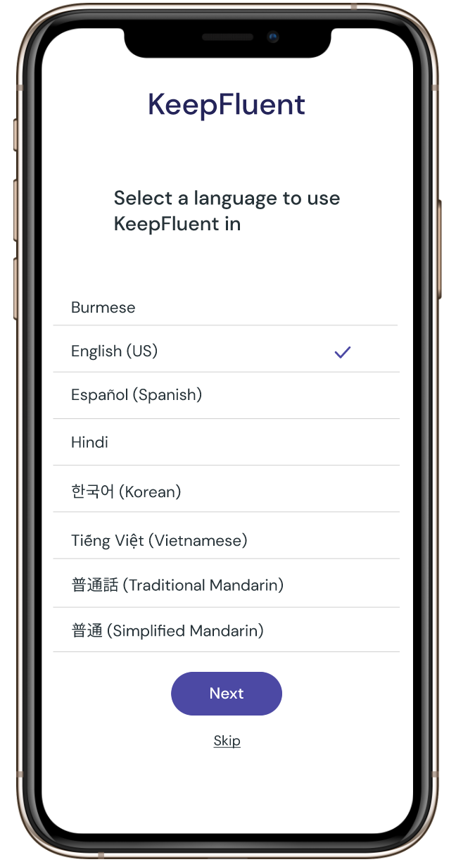
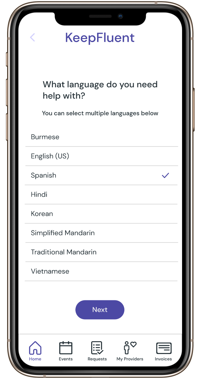
A client-suggested addition: choose what language to view the app in
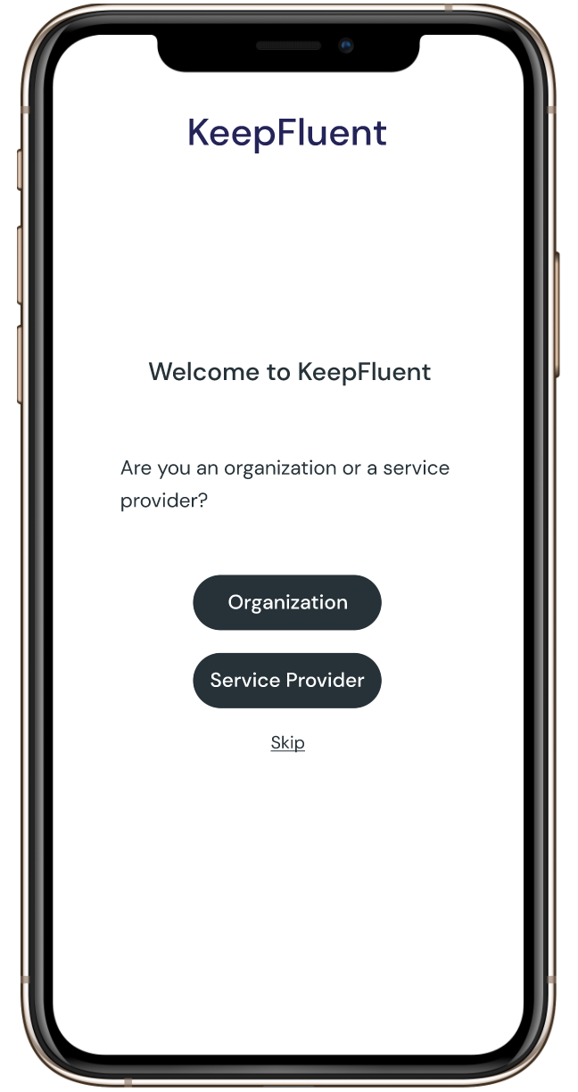
Option for users that affects the rest of onboarding
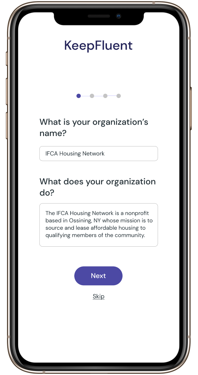
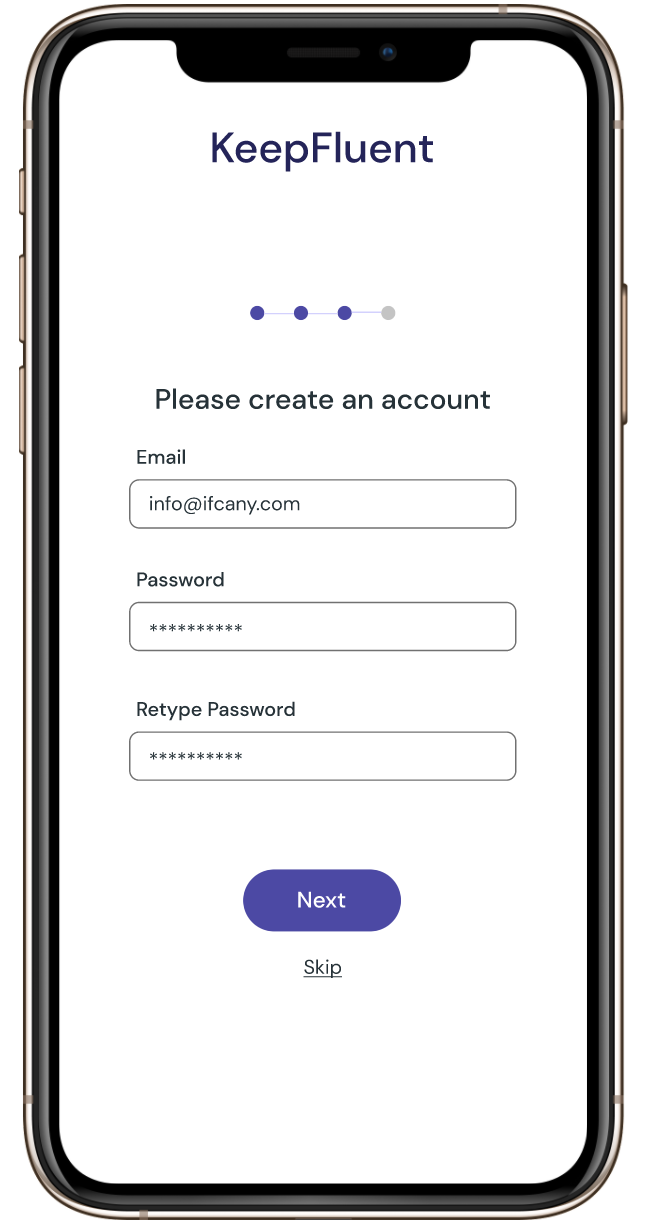
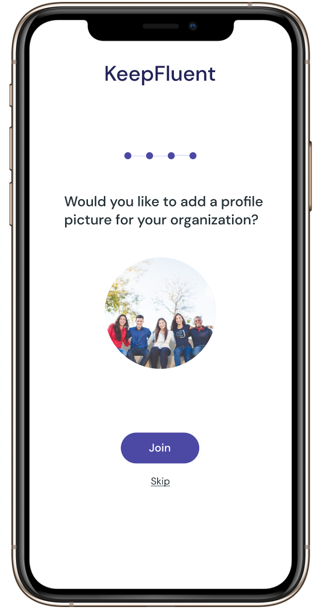
Onboarding Step 1

Onboarding Step 2
Onboarding Step 3
Onboarding Step 4
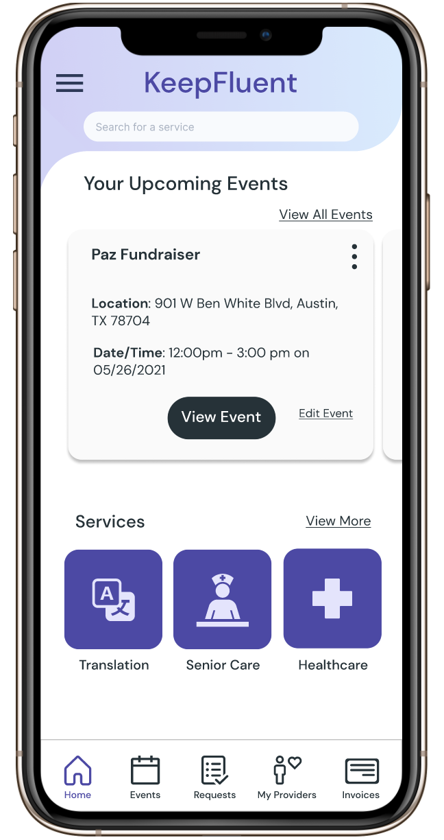
KeepFluent Home Screen
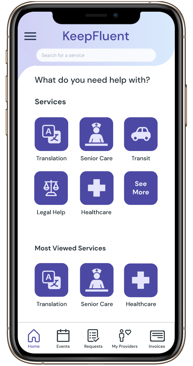
Detailed screen when user taps search bar
First filter for user to refine initial search results
Search Results Screen
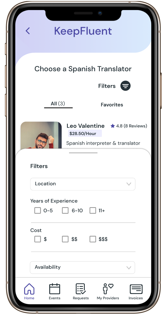
Pop-up card containing additional filters
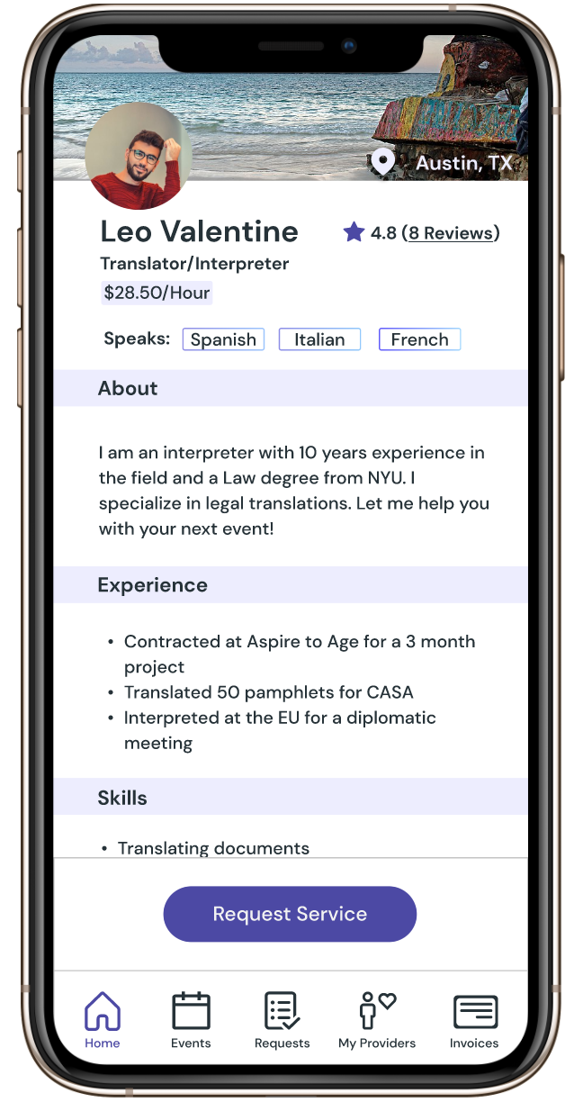
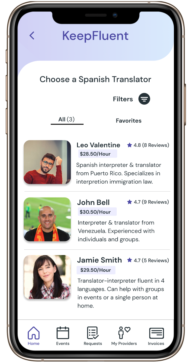
Translator Profile Screen
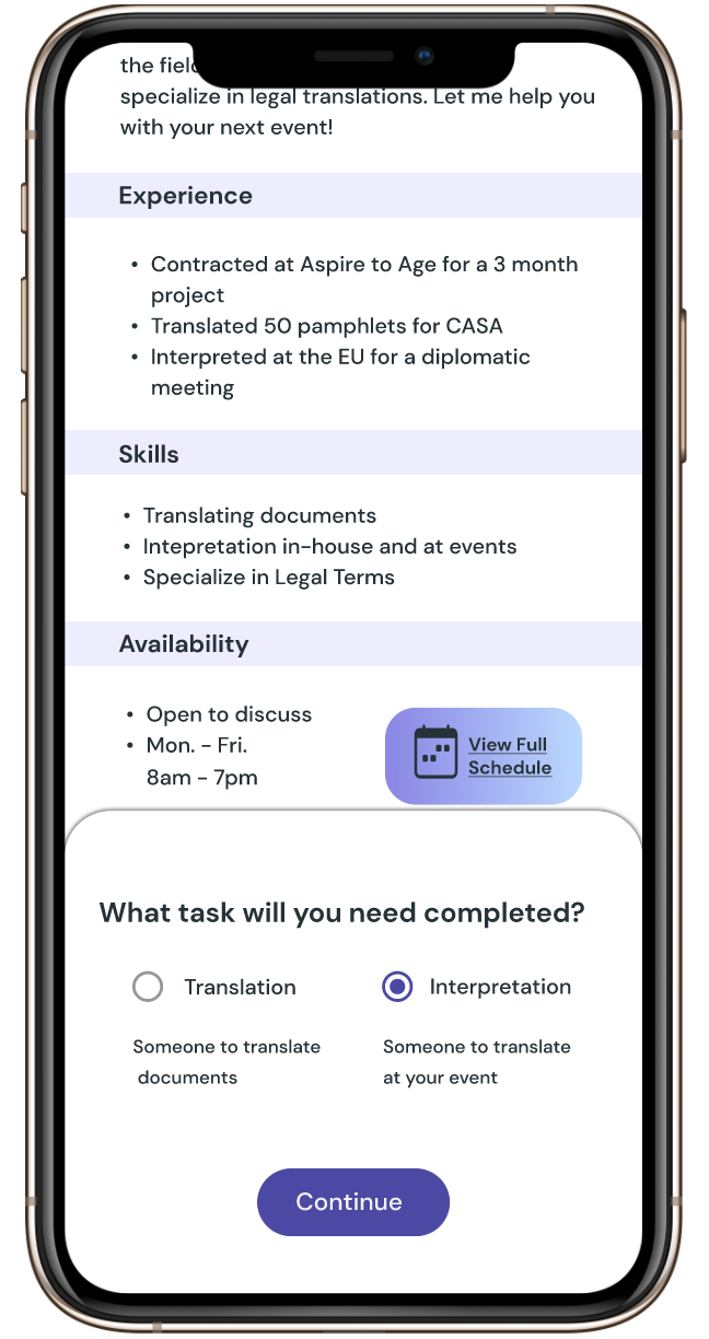
Intermediate pop-up card when user taps "Request Service" - this was designed after some confusion during usability testing
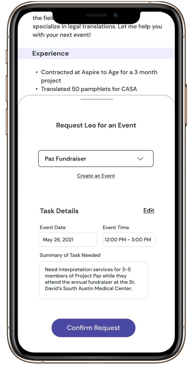
Full Request Form Pop-Up Card
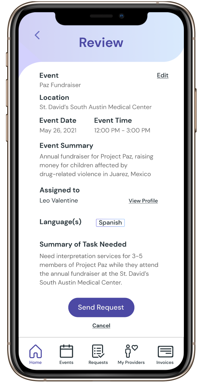
Request Review Screen
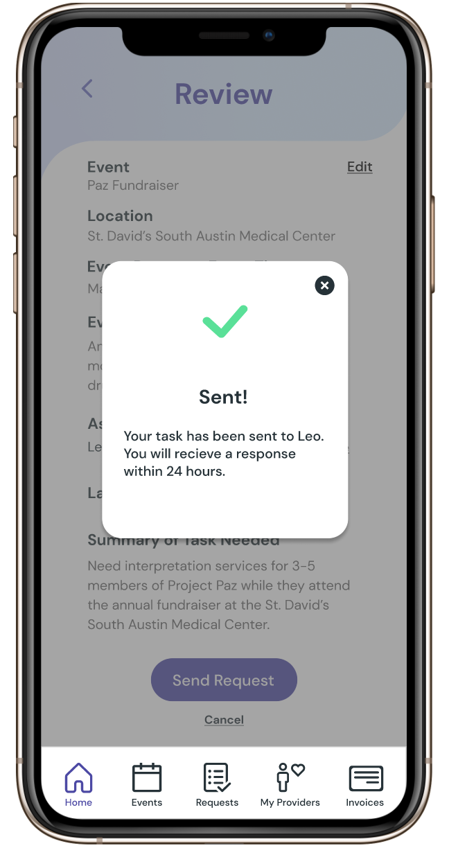
Confirmation Notification
The Prototype
If you would like to click through the prototype, click the button below.
You can also watch a walkthrough of the prototype in the video below.
The Takeaways
Transparency is essential. Both your teammates and your clients will appreciate you for it. There were several moments during this sprint that openness and honesty led to results. That being said, lean on your teammates! It’s a special feeling to be working with an open-minded team toward a common goal. Cherish it.
Research is conducted for a reason! Without the user, there is no UX. Always, always go back to your research insights, especially if you are at an impasse in a project. Your users will tell you what to do. I think our team learned a valuable lesson in this, and we emerged as stronger designers because of it.
Getting the opportunity to work on a project with real social impact is a joy. Even in the most stressful moments, it always gave me a boost to know the work I was putting in could potentially help someone down the line. To me, that’s what it’s all about. Thank you to my teammates Lio, Rachel, and Kelli, as well as our clients Shubhada and Megha for working with me and making it memorable.